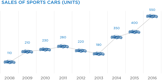
An icon of a car feels so cool when you are talking about cars in a chart. Isn’t so? Let’s see how can we do that!
Assume this data
![]()
And we make a line chart (with markers) out of it.
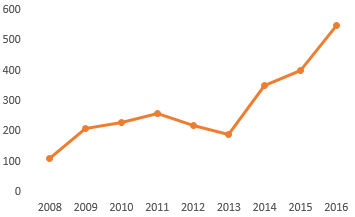
Notice the dots on the line chart
- Those dots are called markers and we are going to customize them
- So make sure that when you are picking up the line chart you choose Line with Markers
Lets get a Car Icon
You can easily find vector icons on the web. Assuming that we have got a car icon in our spreadsheet, let’s plug that into our chart
Here are the steps
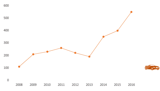
- First copy the car icon using Ctrl + C
- Then select the markers in the line chart and paste the icon using Ctrl + V
- You’ll see that the (markers) dots are now replaced by the car icon
A few things that you must care about
- The size of icon selected is exactly replicated in the chart, so make sure to size the icon appropriately to fit in your chart
- Customizing markers is cool but not always appreciated by good old folks, who still are comfortable with the traditional lines and bar charts. So use it with caution!
More Interesting Charts for You
- How to Highlight Parts of a Stacked Chart – to make it more readable
- Encircle Points in a Line Chart
- Adding Direct Legends to the Chart – to make it clutter free
- Draw a Chart in 1 Key Stroke
- Adding a Total Bubble at the end of the Line Chart
- How to Plot Cities on a Map Chart – One of the coolest charts I have ever made!