 A while ago one of my acquaintances asked me if there was a way to convert a data dump for salary structures into a chart. I asked – can you please show me the data ? She gave me the following! and I returned her what you see above 😎
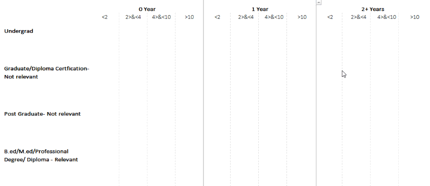
A snapshot of Data Dump
Here is how I did it..
Lets digest the data first!
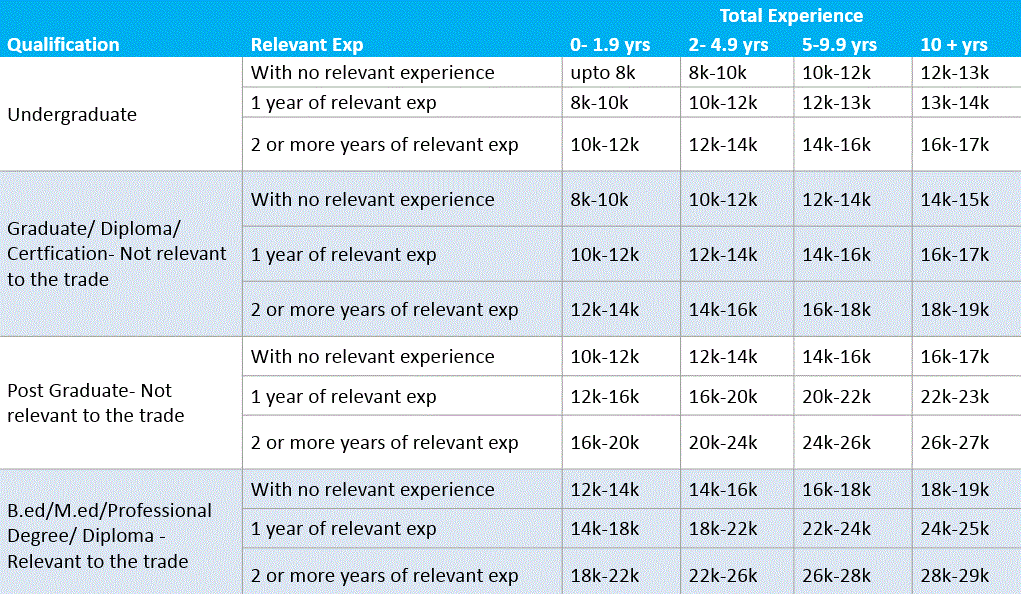
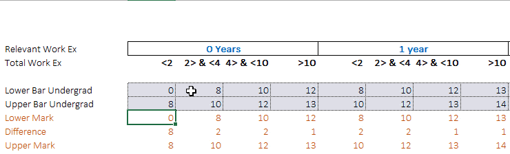
The data that we have here [download the data] is a salary structure and consists of
- Cross tabular representation of 4 qualification levels
- Which is spread under 3 categories --> no experience, 1 year experience and 2+ years experience
- And then each of these 3 categories then have a total experience bracket (0-1.9 yrs, 2-4.9 yrs, 5-9.9 yrs and 10 + yrs of total experience)
- Each of these experience brackets have a salary distribution level
Our Objective and the Idea 💡
Our objective is to make a visual representation out of this data (possibly a chart) so let try and make a quantifiable matrix with numbers. I want the chart to show the following
- The upper and lower salary points
- The height of the bar shows how large is the variation between the upper and lower salary points
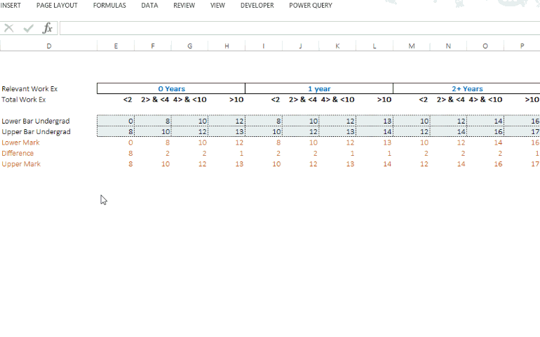
Getting the data ready for chart
I am just redoing the data in a form a matrix which going to be easier for making the chart 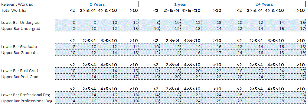 Click the picture to enlarge
Charting Logic and the Chart!
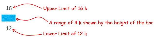
The logic is pretty simple.. consider this data
- The Lower point – 16K
- Upper point – 20 K
So I need the chart to start at 16 and end at 20. The difference of 4 (20-16) needs to be stacked on top of 16 and then to show 20k I need to stack 20k (upper point) on top of 4 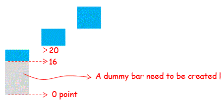
To make a chart like this for any data point I would need 3 things
- Lower bar or starting point – we have it! (dummy data and we will hide it later)
- Upper bar or ending point – we have that too! (dummy data and we will hide it later)
- Difference or height of the bar (upper -lower) – Shows up as a bar in the chart
Creating the dummy data
Simply calculate the difference (upper point minus lower point) and you already have the upper and lower data points
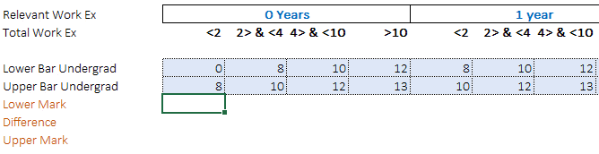
we need to do the same for each of the 4 categories (Undergrad, Graduate, Post Graduate & Professional Degree Holder)
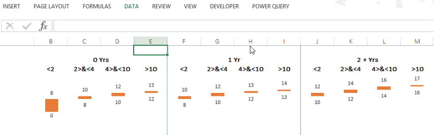
Making the Chart and Formatting it
- Select the data (under graduate) and make a stacked column chart
- Now some formatting like setting up the data labels, un-coloring the lower and the upper bars (dummies), adjusting the axis values and removing unnecessary outlines. Pull and stretch it.. done!!
- Remember if you want to open the Format Options for any charting element you can use the shortcut (Ctrl+1) – want to read it in detail ?
- Learn more on chart formatting techniques Charts Part 1, Part 2 and Part 3
Create the same chart for the rest 4 categories too (Undergrad, Graduate, Post Graduate & Professional Degree Holder)
 Click the picture to enlarge
Putting it all together
Now place all the charts and the categories together under the relevant headings. Next we need to create a switch (to build an option to see only a part of the data). Scroll up and see (in the first picture) the green switch which turns on and off the chart.
Creating a switch with data validation
- Go to the cell above the heading
- Choose data validation and choose ‘list’ from the drop down
- Specify 0,1 in the box and press enter
- The logic is when the user will select 0 the chart will turn off and when it is 1 the chart shows up
Connecting the switch with the data
Multiply the switch or the drop down with value (0 or 1) with the data. A few things to note here
- Multiply the data with the correct switch
- And make sure to freeze the cells (by pressing F4) – Learn Cell Referencing
- So if the drop down is set to 1 it will show the data (number x 1 = the number)
- If the drop down is set to 0 it will hide the data (any number x 0 = 0)
Final Touch
- You may see that when we turn off the switch the chart shows 0s which is not really classy.. the chart should just disappear for which I have written a custom formatting code 0;; Learn more about custom formatting
- Draw neat lines between to separate the categories
- This visualization looks so much better in a presentation
Done!!
Have you ever tried to convert a data dump into a meaningful visualization? Please share your experiences?