
A few days ago I wrote why I consider PowerPoint Templates Bull Shit ! They truly are! Today I am writing about the only template that has worked for me for almost all business presentations that I have churned out
My Rules of an Ideal Template
- It should be free of fluff (unnecessary colors, designs, objects and other like minded crap)
- It should have a lot of free space for my creativity to flow in! I am absolutely against wasting the slide real estate
- It should have the most essential branding elements but they should not be distracting
Here is the Template that I use
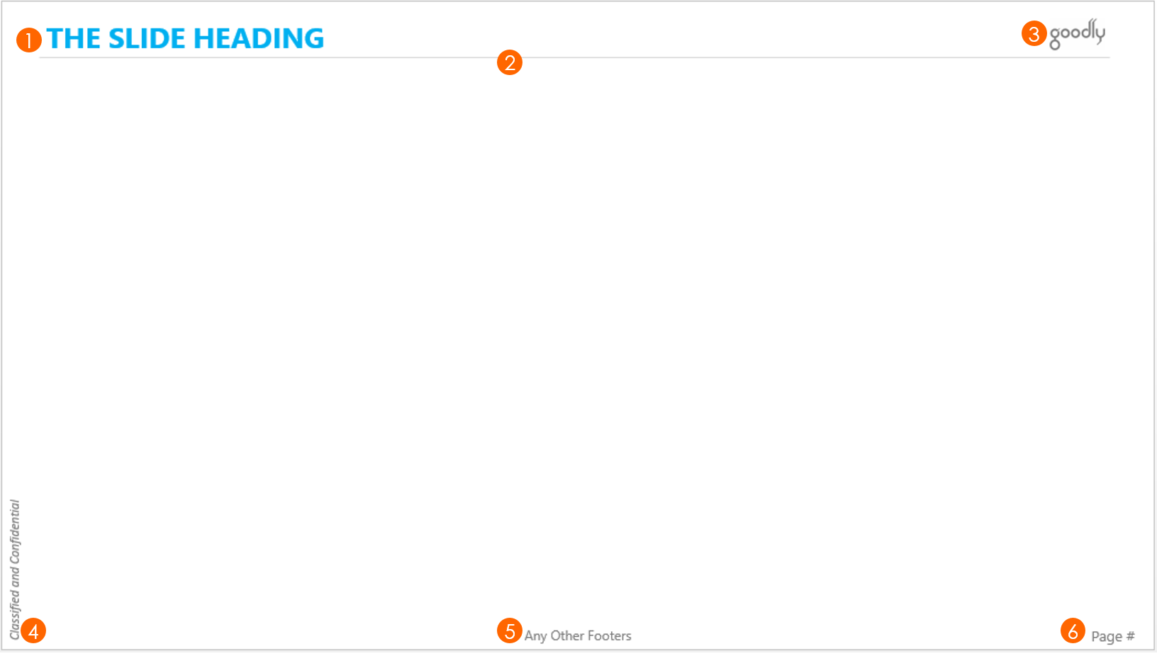
Click image to enlarge
Download this Template from Down Below
The elements of my template
- The Slide Heading – The color of the font typically matches the slide theme or grey/black are evergreen! I use sans serif fonts to remove the clutter. The typical fonts (ranging 24 – 28 pts) that I use for heading are
- Century Gothic,
- Segoe UI (bold),
- Calibri,
- Arial Rounded MT Bold,
- Microsoft JhengHei (bold)
- The Divider – Think about what is the purpose of the line that separates the headline with the presentation body. I just said it!! Yes it just separates the headline with the body. A light, faded off, 0.5pt line would just do good. The darker and the thicker the line is the more it intrudes into your attention
- The Company Logo – Not too large or small in size, just make sure it legible! And because our background is white you don’t have to worry about any patches that appear in case of a colored background!! You are welcome! 😛
- The Classified and Confidential Stamp – Some companies have it as a mandate in their Presentations. The rule stands – light faded off in 10 – 12 pt font, not too catchy but enough to make its mark!
- Any Other Footers – I typically use this space for writing the explanation to the asterisks or to show the source of the data/bibliography etc.. but feel free to use it for your own purpose but the rule stands!
- Page Numbers – They are a bit more important. Make them of size 12 – 14 pt . You can also think of displaying them as Page 1/5, Page 2/5 etc.. to help the audience, gauge the progress of the presentation
- There isn’t a seventh element – I have served most presentations with the above 6 points or less. You can customize them as per your needs but now you now know the rules!
More Resources on PowerPoint
- Learn to use Slide Master to Create an Effective Template
- 7 Tips to Instantly Beautify your Presentations
- 5 Classic Animation Styles
- How to Adjust the Orientation of your Slides
- How to Change Fonts in All Slides in One Go!
Tell me about your most effective template that has always worked! I am all ears