I am excited to write the first post of this year! This post is going to help you simplify your stacked charts. Let’s get started!
The problem with Stacked Charts
To set the base for why do we need to highlight data series in the stacked chart, I want to talk about what is wrong with stacked charts
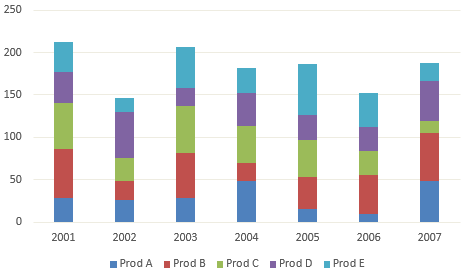 --> Look at this chart
- Too much data at the same time – If you look at the above chart there are 35 data points (7 years x 5 products) all shining bright like my Punjabi Aunty’s wedding dress 😆 Jokes Apart! There is rare probability that you’ll be analyzing all data points together
- Since you have too much data to see at once, the colors keep increasing – The more the stacking is done, the more colors are needed to differentiate the bar divisions. Too many colors make the chart distracting and difficult to read
- Indirect labeling is another problem in stacked charts – And because the bars get stacked on top of one another, you would have to see the color and then infer the label (which is indirect labeling)
- Bars don’t start at the same level – Since the bars are stacked they don’t necessarily start at the same level. It becomes slightly difficult to be more precise when the bars are not starting at the same level
Alright Alright too much bitching about stacked charts .. lets get to the solution !
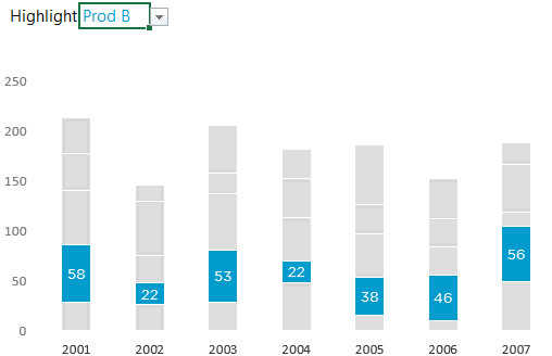
Break the data & show one product at a time
The solution is pretty simple that is to break the chart and focus on one data series at a time. Let’s try and make it a dynamic too!
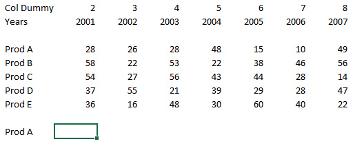
Here is the Data
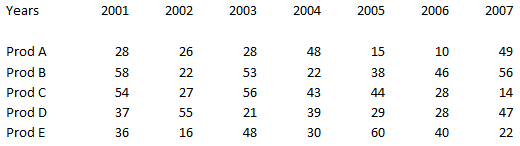
7 Years of Product wise Sales Data. Please note that the empty row between the years and the data is there for a reason, which is the part of the trick and I will explain as we go along. Are we ready?
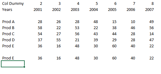
Lets Create a Drop Down with Data Validation
Set up a simple data validation list feature to create a drop down
- From the Data Tab Click on Data Validation (Shortcut Alt A V V)
- Select List and link the source to the product list on the sheet
- This will help us pick the product to highlight
Simple Vlookup to pull the selected product data
- The VLookup Formula is pretty simple, please take care of proper cell referencing. I guess you can manage that
- Please note that I have created a new row Col Dummy to change the column numbers automatically. Although this is certainly not the most robust way, I agree but in this case we are fine this! Let’s keep moving
The Highlighting Logic
Before I dump the trick on to you, let’s understand the logic

We need a dummy to support the highlighted product. So the dummy will be the sum of all the product values below the selected product. Now all that we need is a formula to dynamically calculate the sum of all products before the highlighted product
The Dummy Formula
Note that the Dummy formula is taking the sum of all products before the selected product. If you are more curious about the formula here is the explanation
=SUM(OFFSET(Start from empty cell,,,MATCH(Selected Product, Product List, 0)))
- The Offset Function will make a range of all the values before the selected product
- The Sum Function will take a total of all the values that are given by offset
And that is exactly that we wanted!
Making a Stacked Chart
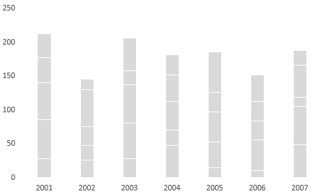
- All I have done is made a simple stacked chart with all products data.
- Colored all series as grey
Time to add the Dummy to the Stacked Chart
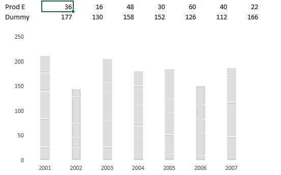
There are 5 main things to be done
- Add the selected product and the dummy to the chart that we have created
- Put both of them (selected product & dummy) on Secondary Axis
- Change the order of the series in the Select Data Box. The highlighted series should be on top of Dummy
- Change the color of Dummy to ‘No Fill’
- Fix the axis max point to 250. This will make sure that the axis does not change automatically even if the data changes
And our chart is ready.
More Dynamic Charts
- How to add a total bubble at the end of the line chart
- Bubble chart Matrix with scroll bar
- Stock Ticker Chart in Excel
- Economist Chart Reworked – World’s Biggest Economies