When you create a chart with multiple data points, showing data labels for all the values can make the chart quite cluttered and busy. What you can do instead is add or remove data labels of the chart with a click
Let’s see how can we make this work..
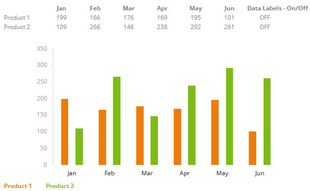
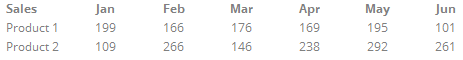
Let’s say we have this data!
For simplicity reasons, I am
- Taking 2 product lines and their 6 month sales and
- Making a simple column chart with this data
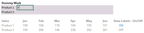
Next we add 2 data validation drop downs!
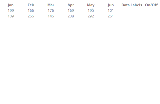
- In the cells next to the “Jun” column, I am going to add 2 data validation drop downs with values “ON/OFF”
- This will allow me to add or remove data labels from the chart
Now link the drop downs to a dummy calculation!
- A simple IF Formula logic
- If the Drop down cell is “On” then show the Value
- Else show a 0 (zero)
- Take care of cell referencing while writing the formula
Adding Dummy Calculations to the Chart
Now this is where it gets interesting, the reason why we made dummy calculations is because
- The Dummy is linked to the drop down (On/Off)
- When the dummy is added to the chart the dummy values can appear or disappear from the chart depending of the On/Off switch
This is how it works. Step 1) Add the Dummy values to the chart
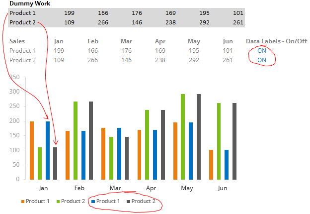
Note few things
- The data labels are turned – ON
- The 2 products (dummy calculations) are added on the primary axis
See this – If you don’t know how to add values to the chart
Step 2) Place the dummy on the secondary axis
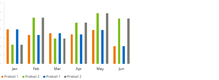
- Select the 2 data series (one by one) and use CTRL + 1 to open format data series box
- Then switch them to the secondary axis
- Note the secondary axis appears (we will hide that later)
Step 3) Add data labels and fill the dummy with “no fill”
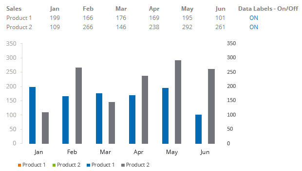
- Right click on the bar (dummy calculation) and add data labels
- Right click again and go the fill tab and choose “no fill”
A bit of formatting left!
- The secondary axis should be hidden. Follow the steps
- Select the secondary axis and press Ctrl + 1 to open the format axis window
- In the format axis window scroll down to Labels
- Under Labels choose “None”
- Note this is will hide the axis and NOT delete it.
- The zeros should not appear when you turn the switch off. To do that
- Select all the values in of the dummy calculations and press Ctrl + 1 to open the format cells box
- In the Number Tab go to Custom
- And delete default code (General) and write this instead 0;; (this means don’t show the zeros)
- Change the data labels to match the color of the bar (it reads easier that way)
- The legends (for dummy calculations need to be removed)
- Click on the legend and then click again to only select dummy legend
- Press delete
DOWNLOAD THE ADD REMOVE DATA LABEL CHART FROM BELOW– Excel file
The file also contains a cool VBA method that you can try it out..
Other Interesting Charting Tricks
- How to select small data points in a chart
- How to make a dashboard in 15 mins
- Use camera tool to make dynamic charts
- Threshold chart in Excel
- Data Validation as On/Off switch
- Timeline Chart in Excel
- Performance Rating Chart in Excel