The reason why I call this as a Threshold Chart is because the lower point can only be equal to the threshold and not exceed it!
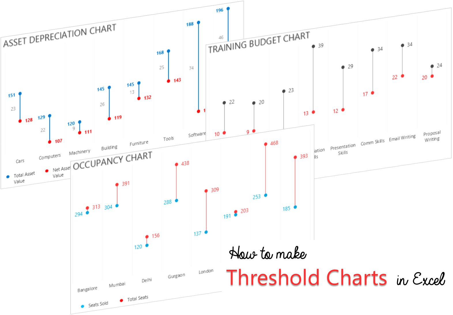
Although I am using Asset Depreciation Data for this chart but a threshold chart can be applied to multiple places. I’ll talk about its applications in a bit more detail in a while… but first the chart
The Charting Idea..

The idea is to focus on the difference between the threshold and current level.
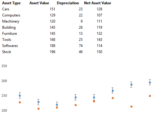
Lets assume this data!
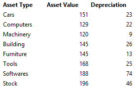
FYI :
- Assume the Asset Value is the price of the asset at which it was purchased.
- Depreciation is the normal wear and tear of the asset during the course of its use!
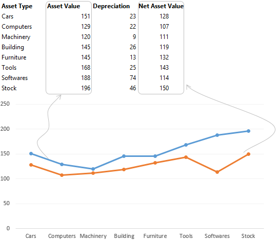
In this case our chart will be like this

When the blue dot touches the ground (x axis) the asset is fully depreciated!
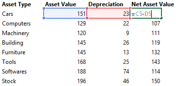
We also need to calculate the Net Asset Balance = Asset Value – Depreciation
Now let’s make the Chart!
Note that I have
- Chosen the chart type as Line Chart with Markers
- The Blue Line denotes the Asset Value
- The Orange Line denotes the Net Asset Value
The Next Step is to remove the Line by choosing no outline on each of the data series
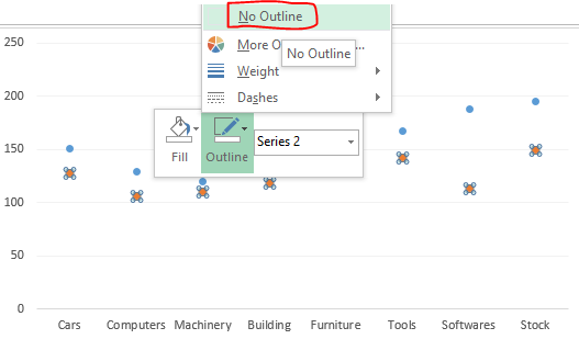
Add the Error Bars for the connectors between the 2 dots
- Select the Bot Dot
- Go to the Plus sign on the side of the chart
- Check the Error Bars Option
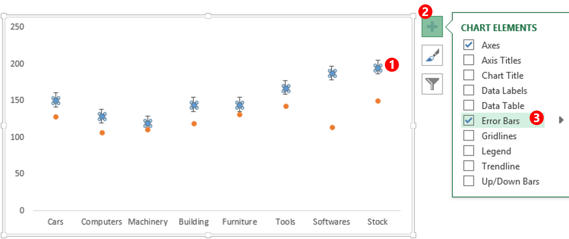
- Although we have got the error bars but they are no where close to the way we want them
So let’s Format the Error Bars
- Select the error bars and press Ctrl+1 to format it
- In the formatting dialogue box change the direction to Minus and set the style as No Caps
- Now specify a Custom height of the error by clicking Custom and Specify the Value
- Link the negative error values to the Depreciation data from the spreadsheet
With a bit of formatting (Applying Legends, Title, Data Labels, Removing the Axis etc..) our chart is done!
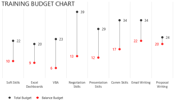
Applications of this Chart
1. Chart for Training / Department Budget Balance : The longer the connector the more the budget balance
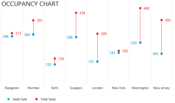
2. Occupancy of an event in different Cities : In this case the longer the connector the more seats are vacant
Caution for Threshold Charts..
- This Chart will become difficult to read where the values can be more than the threshold
- This is particular good where the values will be less or equal to the threshold
Other Interesting Chart Types
- Highlight any Bar in a Column Chart with a Drop Down
- Use Drop Downs to highlight Line in a Line Chart
- Timeline Chart in Excel
- Dot Chart in Excel
- Men & Women – Funnel Chart Visualization
Let me know your thoughts and how will you use the threshold chart in your data!