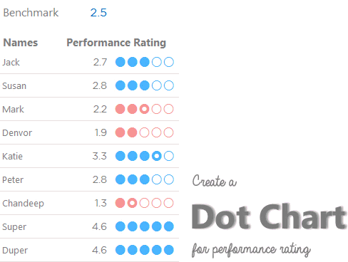
The other day while helping someone out to create a visualization from a performance rating data, I thought of creating a Dot Chart, where dots get filled depending on the score. I really liked what finally came out and thought it would be of much use to you as well!
So, here we go !
Things needed to create this Chart
- Performance Rating Data – But obvious!
- Empty Dots
- Semi Filled Dots
- Filled Dots
To hunt for Empty, Semi Filled and Filled Dots I looked into the Symbols option in Excel
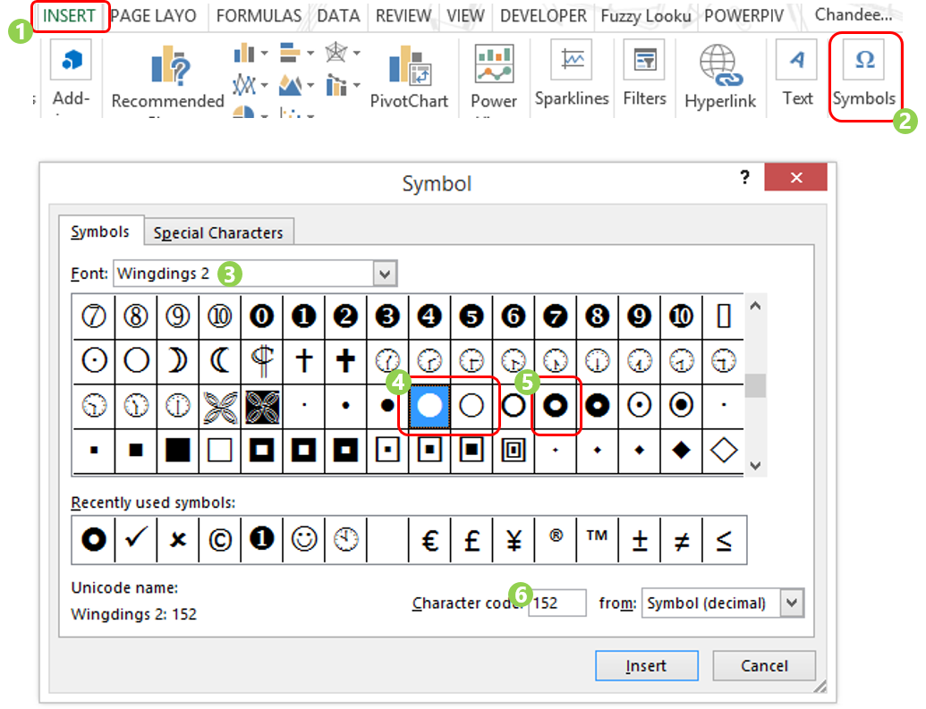
- In the Insert Tab
- Click on Symbols
- Now Change the Font to Wingdings 2 (most likely you would have that pre-installed)
- Scroll down to find a Filled Dot and an Empty Dot
- Semi Filled Dot will also be around
- Notice the Character Code for each of these Dots
Since Excel doesn’t understand text so we will be using these (ASCII) codes to create the dots. Let’s keep moving
Meaning of Filled Dots, Semi Filled, Empty Dots
Filled Dot
![]()
Means that we have an integer value. We are also assuming that numbers with decimal places greater than .5 will be rounded off to the next integer. So 3.6 will be rounded off to 4 but 3.5 will be considered as 3. For example
- 3 Filled Dots for 3.2 or
- 5 Filled Dots for 4.7
Semi Filled Dot
![]()
Means that we have a fractional value which is less than or equal to .5 For Example
- 3 Filled Dots and 1 Semi Filled Dot for 3.2
- 4 filled dots and NO Semi Filled Dot for 3.7
Empty Dots
![]()
Are the balance from a maximum value of 5. For Example
- 3 Filled, 1 Semi Filled and 1 Empty Dot for a value of 3.2
- 2 Filled, 0 Semi Filled and 3 Empty Dots for a value of 1.7
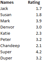
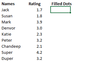
Crunching the Numbers
We start this data where we have Names and some random ratings, (too bad I got a 2.1 🙁 )
Next we find how many Filled Dots do we need
- If you don’t know, check out The CEILING Function (how it works and examples)
- CEILING(Rating, 0.5) Applying CEILING Function the rating will push the rating to the next multiple of 5
Now finding out how many Semi Filled Dots do we need
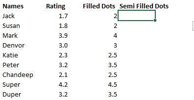
- Learn to use the INT and CEILING Function with an example
- Rating – INT (Rating) We are first finding the fraction from the filled dots
- CEILING(Rating – INT (Rating),1) The CEILING Function will convert the fractions to 1
Note a few things
- The values of Filled Dots are in Decimals (which are less than or equal to 0.5)
- We want to apply a Semi Filled Dot for all the values containing decimals
- We are converting the Semi Filled Dot values to whole numbers (1) because we would need 1 Semi Filled Dot where there are decimal places
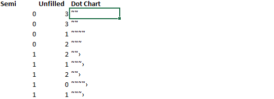
Calculating the Unfilled Dots
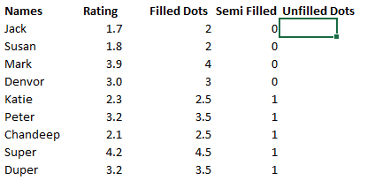
- INT(5 – Rating) We are subtracting the Filled Dots from 5 because that’s our maximum rating
- Also then converting the decimals into whole numbers
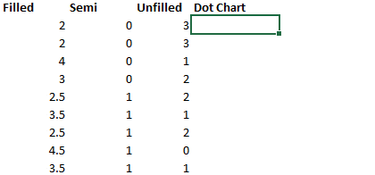
Making the Chart
Now that we have the back up ready lets make the chart. But even before I start making the chart, I want you to recall the Codes for the Dots
- Code for a Filled Dot – 152
- Code for a Semi Filled Dot – 155
- Code for an Empty Dot – 153
PART 1 – CREATING FILLED DOTS
- Don’t worry about the symbols that show up. Our final move is yet to come 😎
- Check out the REPT Function if you don’t know how to use it
- All we are doing is repeating the Dot, filled number of times and the CHAR formula is helping us convert the code (152) into a Dot
PART 2 – ADDING SEMI FILLED DOTS
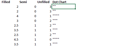
- Don’t worry about the symbols that show up. Our final move is yet to come 😎
- After the Filled Dot we need to have the Semi Filled Dot so we use the & operator and combine the formula
PART 3 – ADDING THE EMPTY DOTS
- Don’t worry about the symbols that show up. Our final move is yet to come 😎
- In the end we need Empty Dots so we again combine the formula with the & operator
NOW OUR FINAL MOVE !
This is like the icing on the cake, an Ace to finish it all
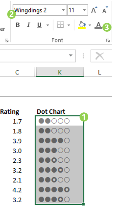
- Select the data
- Change the font to Wingdings 2
- And the color the font in a lighter shade of grey
- Boom! There you have it!
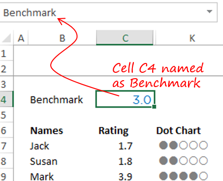
A Benchmark – to give it more meaning!
Wouldn’t it be nice to color all the dots as red if the score falls below a benchmark?
And let’s say our Benchmark is 3
Apply Conditional Formatting Rule
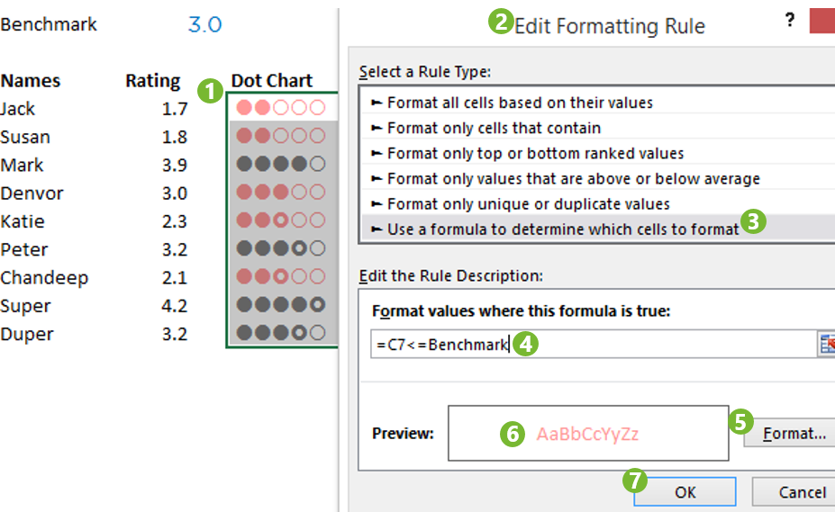
- Select your Data
- Open a New Conditional Formatting Rule – (Use the Shortcut ALT H L N)
- Select the Option – ‘Use a formula to determine..’
- Paste the following formula =C7<=Benchmark. C7 contains our first rating
- Set the Format as you like (The format will be applied if the Rating is below or = 3
- See a preview of the Formatting in the Preview Box
- Click Ok
And we are done, baby!
Where can you use this Chart – Pros and Cons
I cannot end this piece without mentioning its utility and may be some pros and cons
- Utility : Use this chart for showing ratings, describing complexity, high or low signals etc..
- A Pro : The filled and unfilled dots act as an excellent visualization for getting an approximation of the rating
- A Con : Not a good chart type when the rating is done on a larger scale. May be a scale point of 10. Too many dots might tend to distract rather than making it easier to interpret the chart
Learn to make some other interesting charts
- Line Chart with Part Selection
- Line Chart with Phases
- InfoGraphic Charts PART 1, PART 2
- Target Charts