
If you have been working with Power BI for a while and wondered how to create a Pivot Table like excel, this post will be your savior.
I am going to break down the process of creating a Pivot Table in Power BI in 4 steps
- How to to Create a Pivot Table in Power BI
- How to format your (Power BI) Pivot Table – Similar to Excel
- Slicing and Dicing Data
- New Features in Power BI Pivot Tables that weren’t there in Excel
This is going to be a long post, but nothing too complicated and to make it more interesting I have included videos for each section.
Let’s get started..!
1. How to Create a Pivot Table in Power BI
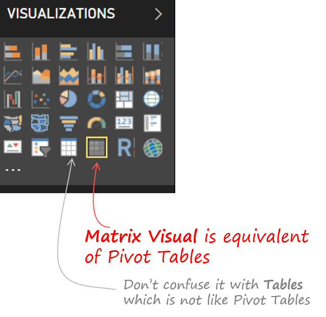
First off, there is no “Pivot Table” in Power BI but there is a “Matrix Visualization” which is almost equivalent to a Pivot Table in Excel. It offers nearly the same features as Pivot does in Excel but they are named differently and of course placed differently.
Let’s take a look.
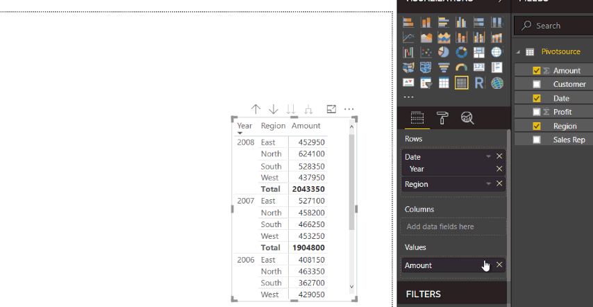
To create a Pivot, pick up the “Matrix Visual” and NOT the Table visual
As soon as you create a Matrix, you’ll get similar options like you do in Excel i.e. Rows, Columns and Values
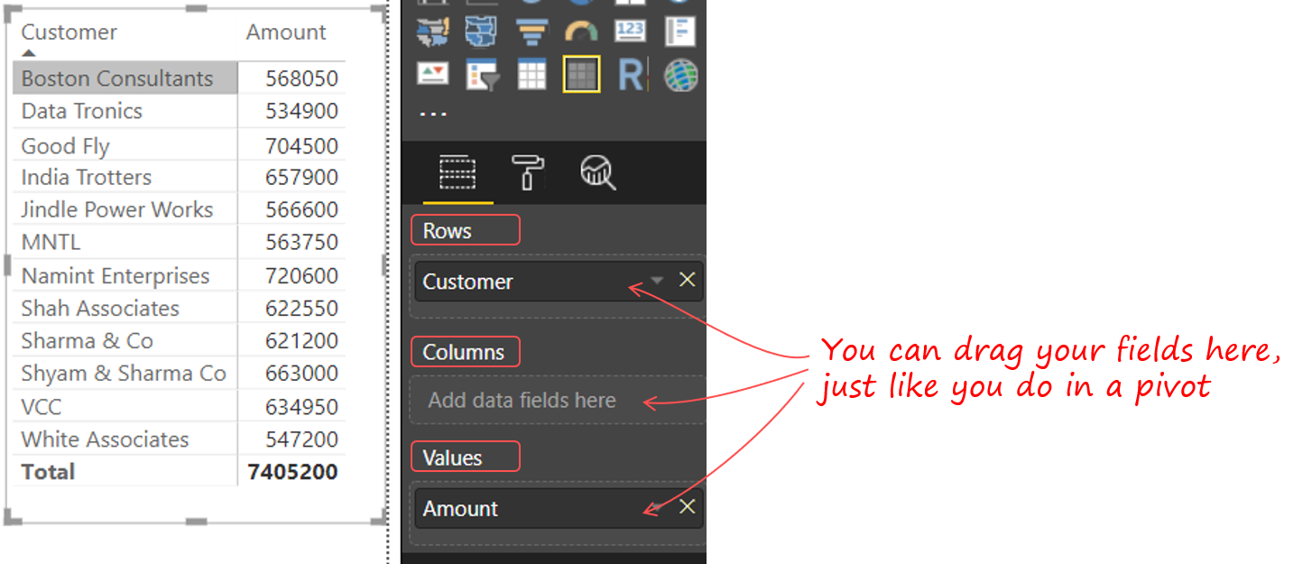
You’ll also find that the Matrix looks a lot cleaner than a Pivot in Excel. Next, lets move on to some formatting features of the Pivot Table
2. Formatting Features
A lot of users often format their pivot tables in a specific way. I am going to cover some of the common Pivot Table formatting tricks and how could you do the same in Power BI
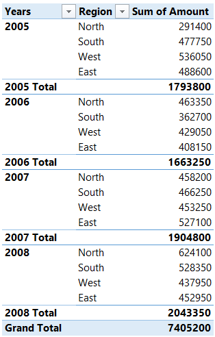
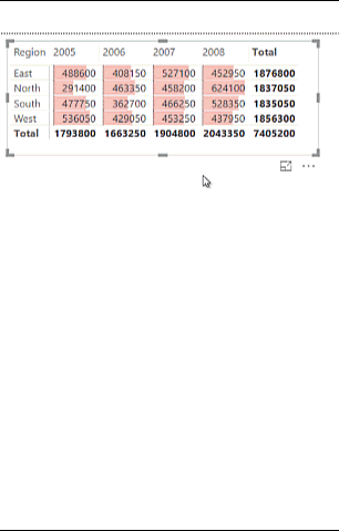
2.1 Creating a Tabular / Classic View – Any pivot veteran won’t be able to stand a pivot table without this. If you don’t know, Tabular / Classic View allows each field in rows to occupy a separate column. Here is how a Tabular View looks in a Pivot Table – (I prefer it over classic view)
Years and Region – placed in row labels are occupying different columns
This can be achieved in 4 simple steps in Power BI
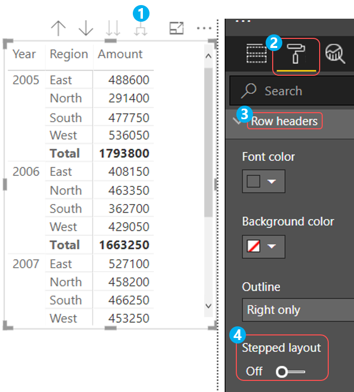
- After you create the Pivot and drag years and region in Rows, click on the double arrow icon to expand the Pivot
- Then click on the “Format Tab” in the Visualizations Pane
- Roll down to Row Headers
- And turn off Stepped Layout
2.2 Adding / Removing Subtotals and Grand Totals
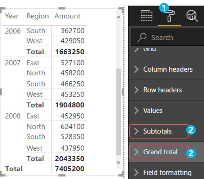
- Simply click on the Format Tab once again
- Roll down over to Subtotals and Grand total
- Apart from turning them on/off
- You’ll also find options to play with font, styles, text size, color, label etc..
2.3 Renaming the fields – Often to customize report users like to give custom names to field headers.
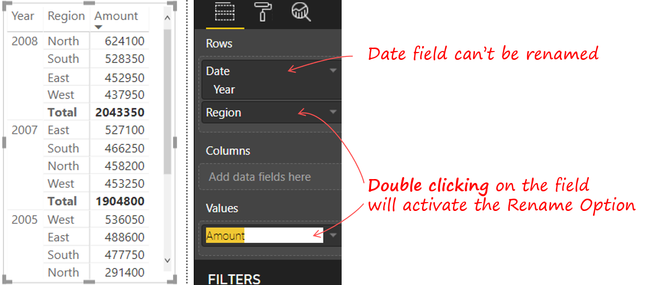
After dragging the fields in Rows/Columns/Values, just double click on the field to Rename it
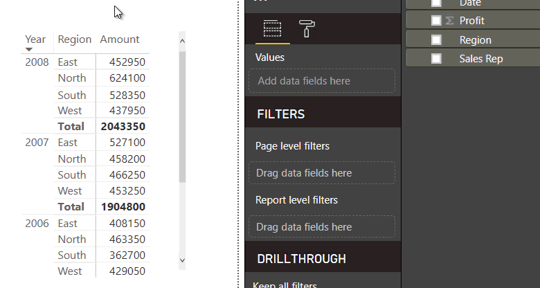
2.4 Sorting Data – Sorting (in a Matrix) is one of the most intuitive tasks in Power BI. You just need to click on the header to sort it in Ascending/Descending Order

2.5 Summarize and Show Value As Option
The summarize and show value feature is one of the important features that let’s you customize calculations in a Pivot Table. To avail that in Power BI here is what you need to do.
- Click on the arrow against the field placed in the values
- You can then pick up the summarize or show value as you like
- Also you’ll notice that there aren’t as many options especially for Show Value As, as compared to Pivot in Excel. I’ll explain the reason why in a while
2.6 Conditional Formatting
Applying Conditional Formatting is quite straight forward.
- Just click on the arrow next to the field in the values
- And select Conditional Formatting
- Rest of the steps are pretty similar to Excel
3. Slicing and Dicing Data in Pivot
Let’s take a look at 3 most common ways of slicing data in Matrix in Power BI.
3.1 Adding Slicers – If you have been using slicers in Excel you certainly would want them in your Power BI report.
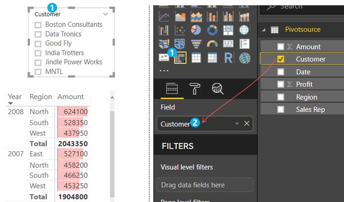
- Just add the slicer visual and
- Add a field (column) to the slicer
- Two more points to add
- You can even customize the look n feel of the slicer by either tweaking the options in format tab or by using custom visual slicers
- If you have toyed enough with slicers you know that you can even enable / disable them from slicing multiple pivot tables. Similar feature is done using “Edit Interactions” in the Format Tab (in the ribbon)
3.2 Filters on Rows / Columns – Pivot Table allows for filtering in Rows and Columns too, the same can be done in Power BI but a little differently
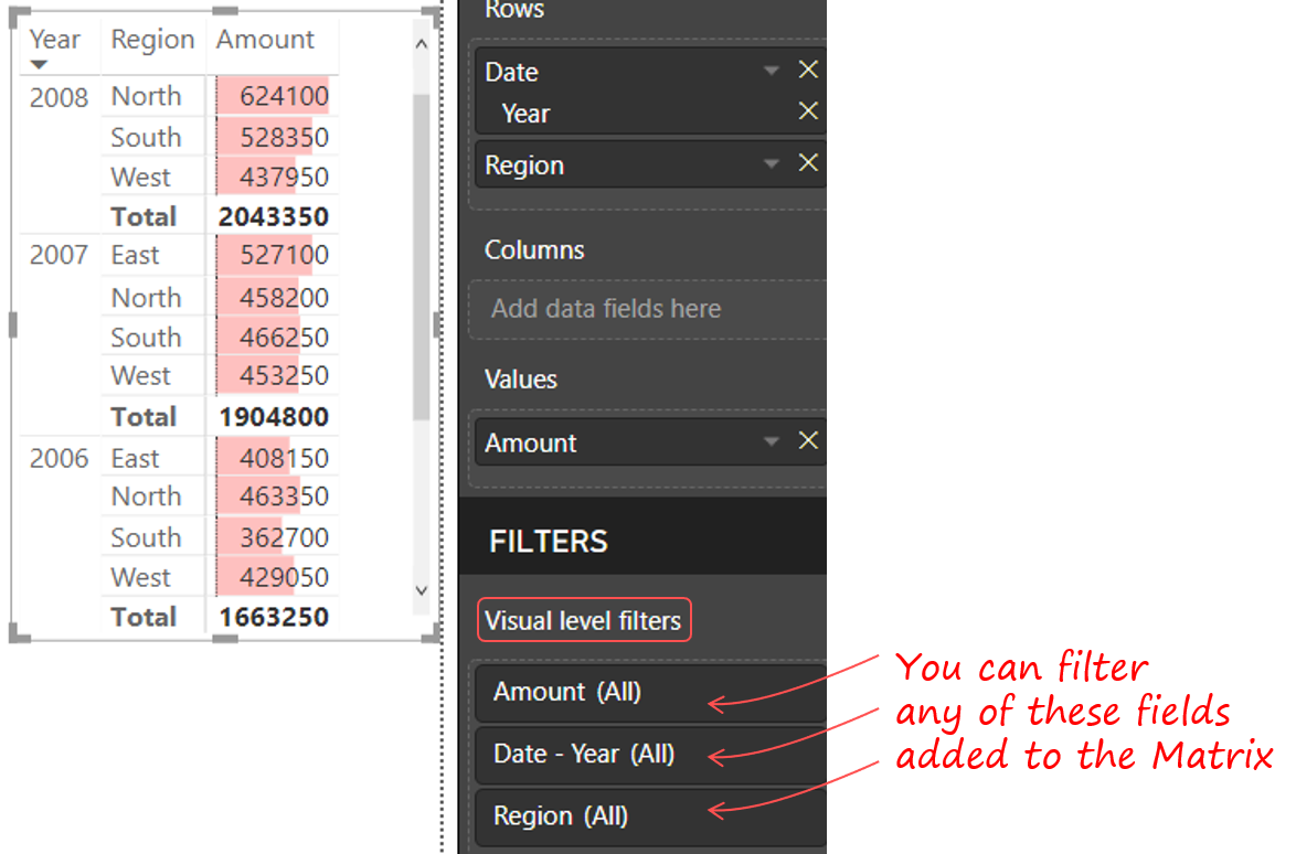
- Power BI gives you the option of “Visual level filters” when you add the data to the matrix visual.
- Note that these filters will just filter the Pivot (Matrix) and no other visual
3.3 Data Drill Downs – Another extremely useful feature that Pivot Table offers is drill down to see the underlying data when you double click on a number in the pivot.
In Power BI..
- Simply right click on the number
- Choose Show Records to see the underlying data points
- Note that this works for numbers, subtotals but NOT grand totals
4. New Features in Power BI (Matrix) – not in Excel
Although Power BI (Matrix) is filled with a ton of kick ass features that can give you sleepless nights (in a good way) but I am going to speak about 3 important ones that I found missing in Excel Pivot Tables
4.1 Field Formatting in Units, Thousands, Million etc.. – I have seen this umpteen times that users would like to denominate a large number in thousands or millions and to do this in excel
- They either end up creating a separate column in the data or
- Using Calculated Field in the Pivot
This can be done pretty conveniently in a Matrix Visual in Power BI. Take a look..
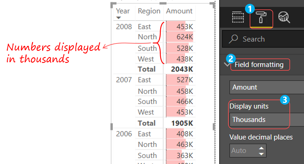
- Select the Matrix visual and go to the Format Tab
- Scroll down to Field Formatting
- And set the Display units as per your need
4.2 Relationships – In the conventional world of Pivot Table you brought together all the columns that you needed from multiple sources into a single table because of the inability of the pivot to accept data from multiple sources.
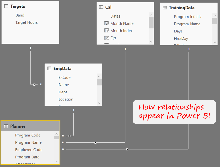
That is the major change in Power BI and this change is so big that I can have multiple blog posts on this one alone. Long ago I wrote a detailed post on Data Models in Excel which covers how to create relationships to bring multiple data sets into a single pivot table
4.3 Ability to Define Measures / Calculated Fields
The regular pivot provides a few ways to summarize and analyse data (for example – Sum, Count, Average etc and additionally showing the values as % of Row Total, Column Total, Difference From, Running Totals and a few other variants) most of them are missing in Matrix in Power BI.
The answer to all these is ability to write measures using DAX (formula language of Power BI). This is yet another topic which deserves multiple blog posts to give you a taste of how powerful it is. Recently I did a webinar on What is DAX, if you don’t know what it is, you must check it out
Have I missed anything ?
I am sure I would have! Let me know =IF
- If there is anything particular that you do in Pivot that I have covered
- Any Matrix features that are kick-ass which I haven’t covered
More Tutorials on Business Intelligence
- Top Product Analysis in Power Pivot
- Vlookup in Power Pivot
- Vlookup in Power Query
- Calendar Dashboard and Analytics
- Learning & Development Analytics in Power BI
Learn DAX from Scratch !!!
A comprehensive course to learn DAX step by step and solve real time problems in Power BI.
DOWNLOAD THE COURSE OUTLINE | ENROLL IN THE COURSE