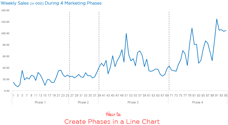
Line charts are most often drawn for time series analysis and it would be interesting to divide our line chart into phases. In this tutorial, I am going to show you how can you divide the line chart into phases.
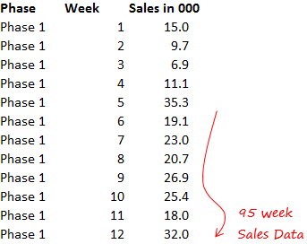
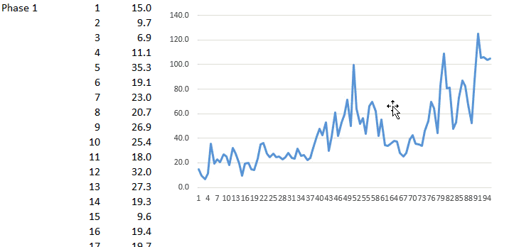
Let’s begin with this data
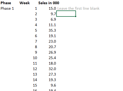
Now retain the first phase number only
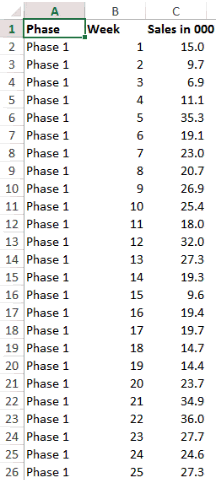
Notice that I am deleting the all phase numbers and keeping only the 1st one (for all 4 phases)
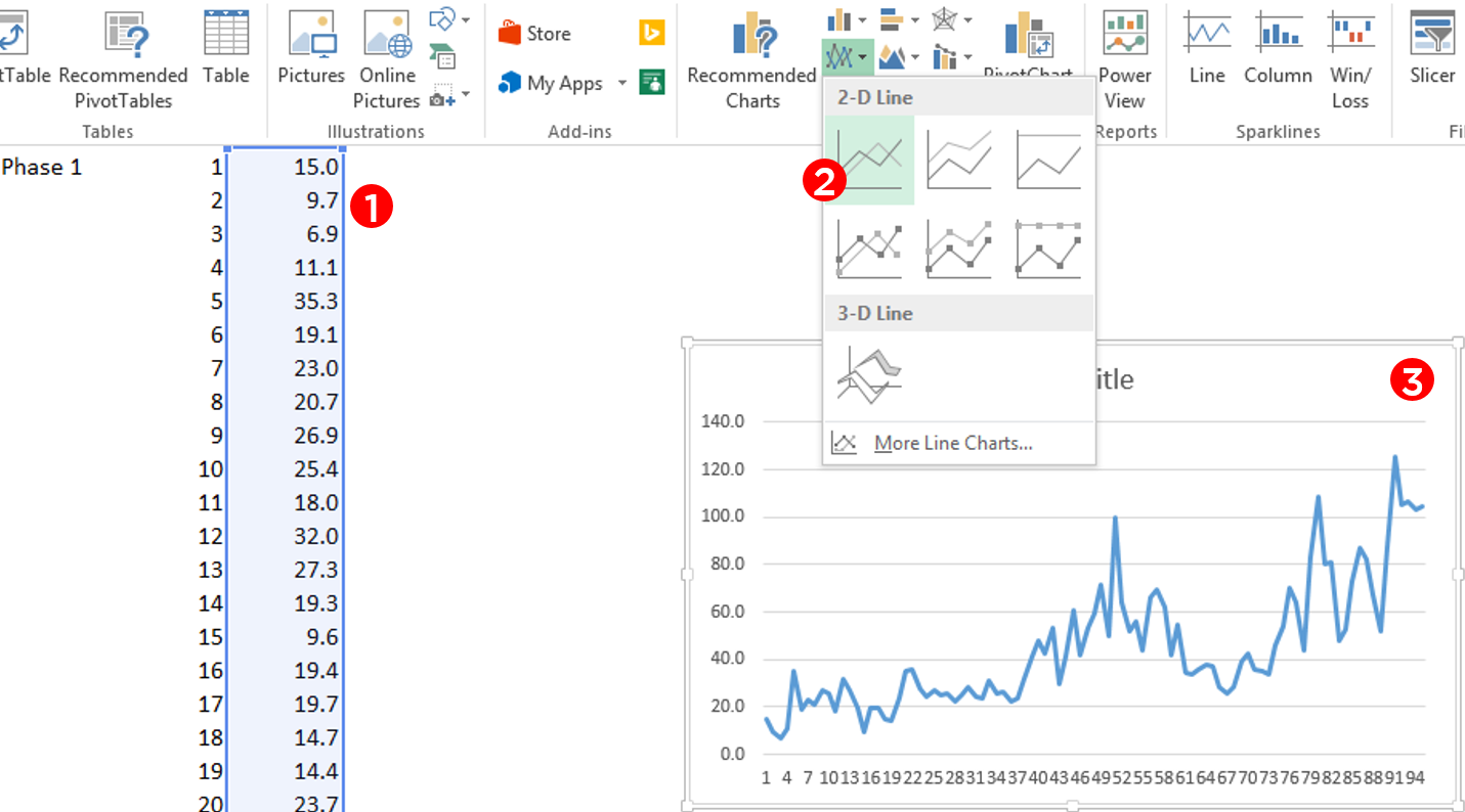
Select the Data and Make a Line Chart
Notice that
- I am only selecting the sales data (and not the weeks and phases as of now)
- Go to Insert Tab and Click on 2D Line Chart
- Line Chart inserted!
Now insert the Phases and Weeks
The reason why I don’t insert Phases and Weeks earlier because weeks are numbers, Excel will by default plot it (as a line) in the chart rather than placing them in the x-axis.
Now creating Straight Lines in the for marking Phases
Although now we already have the phases marked on the X Axis but as an additional effort it would be nice to have demarcating lines running all through the chart
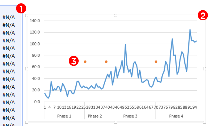
First Comes a Dummy Formula
In the column next to Sales write this formula. Don’t freak out, I’ll explain the logic
=IF(A3>'',MAX($C$2:$C$96)/1.8,NA())
- The reason why we are creating this formula is because this formula will give us the break point where the new phase starts
- What is MAX($C$2:$C$96)/1.8 : I am finding the maximum sales and dividing that by almost half (i.e. 1.8 a random number). You’ll understand the reason in a while, for this in a moment, just keep going with me
If you don’t know how to write IF, Read this
Now Plot the Dummy in the Chart
Ok, I have done a few things here
- First Select the Dummy (then copy it using Ctrl C)
- Plot into the chart (Select the chart and use Ctrl V to paste the dummy)
- Change the chart type for Dummy to Line with Markers
- I have retained the markers (dots) and taken off the line
Now instead of dots we want a line. Get it ?
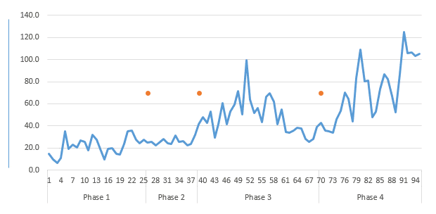
- Create the line using Shapes in the Insert Menu
- Copy the Line
- Paste it on Dots in the Chart
Related Reading – How to customize Markers in the Chart
Before I forget, the reason we created the max formula was because we wanted to have the dots placed almost in the middle of the chart’s height. Smart eh? 😎
Other Interesting Line Chart Tutorials
- Totals at the end of the line chart
- Stock Ticker Chart
- Direct Legends in the Line Chart
- Encircle Data Points in a line chart
- Vertical Line Chart in Excel
- Highlighting Max and Min Points in a Line Chart