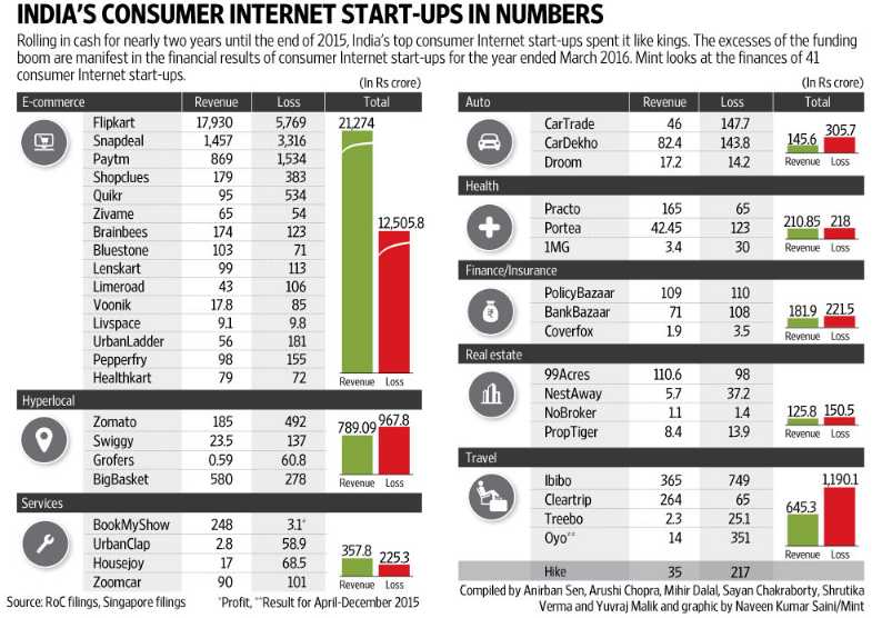
Recently in a casual web browsing (a.k.a time wasting) session I came across an article on how the Indian Tech Start-Ups are bleeding money. The article also accompanied some basic data on revenues and losses.
Chandeep speaking to himself : “I should try making a cool graph / visualization from it”
The next day, a friend of mine was spamming (read sharing on) my facebook wall the same post
Chandeep speaking to himself again : “I should definitely try making a cool graph / visualization from it”
I got to work!
If you have not visited the links above, take a look at the data. I mean it is certainly not bad at all but Excel can make it a hell lot better. Let’s do some Excel magic on this
To make it even more interesting (personally for me) I used PowerPivot (DAX Language) rather than crunching the numbers in Excel
Going down the Rabit’s Hole
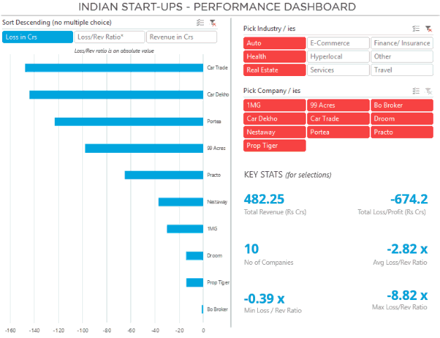
Let’s explore the Dashboard a little more deeply.
The major challenge was that there were just 2 data points (Rev and Loss/Profit). To begin with I made a list of most important metrics that this data could support
- Company wise Revenues and Losess – Given
- Loss to Revenue Ratio – Since almost all companies were in losses, I thought it would be interesting to see how many times is the Loss as compared to the Revenue (the lower the better)
- Overall Selection Feature – Since we are using excel which can make dynamic selection using slicers. I thought of throwing in a few more statistics for the selections made
- Some more Key Stats for selected variables
- Total Revenue
- Total Loss
- No of Companies Selected
- Avg Loss/ Rev Ratio
- Max Loss/ Rev Ratio
- Min Loss/ Rev Ratio
Dashboard Functionality
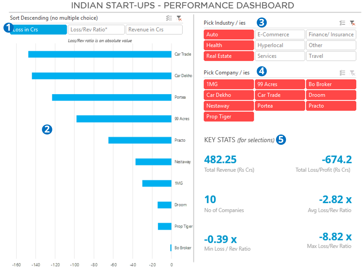
- The Chart Selection Slicer – The user can use this to change the chart between 3 different data points (Revenue, Losses and Loss/Rev Ratio)
- The Chart – This is a standard Pivot Chart (Bar Chart) which is sorted in descending order
- Industry Slicer – The user can also select single or multiple industries
- Company – Within an industy / ies the user can further choose a single or multiple companies
- Key Stats for Selected Options – The user can also see aggregated data for industries/companies selected
The “X” appeal comes from the fact that all of the above is dynamic and the user can filter and visualize the data from multiple angles
Excel Techniques used in this Dashboard
- I used DAX formula language and Pivot Tables to do all the number crunching (I have not talked about DAX on my blog, but if you want further reference go read Rob’s site http://powerpivotpro.com
- The Chart that you see on the left is made using camera tool technique and disconnected slicers
- Plus a lot of slicers were thrown in – If you don’t know about slicers, you are missing a real deal. Read everything about slicers and learn how to make them look sexy
- The key stats section is made up using dynamic text boxes
- After completing the dashboard I protected the entire sheet and locked the objects and hid the unnecessary screen options (like page tabs, headers etc..). Don’t worry you can unlock it without any password 😀
Excel Version Required for this Dashboard
Since Slicers and PowerPivot are not compatible with Excel 2003/07, you’ll need Excel 2010 or higher to be able to play with this Dashboard
DOWNLOAD THIS DASHBOARD FROM BELOW
Your Views about this Dashboard
- Were there any cool features that you would like to replicate it to your Business Dashboards ?
- Or even improvements / mistakes that I could have worked on further
Comment generously and let me know, I love it!
Other Interesting Dashboards
- Indian Republic Day Dashboard
- Cost Structure Visualization – From Chandoo’s DB Contest
- Make a Dashboard in 15 Mins
- 30 Day Challenge Dashboard
– – –
PS: In case you were even remotely wondering about my friend who shared this on fb, he works for the most profitable startup. Don’t guess! Go see it in the Dashboard 😎