
In Part 2 of Infograhic Charts, I’ll share with you to create this interesting infograhic in Excel. Here we have a single human icon, which dynamically gets filled depending on the value chosen in the drop down
Here is how it is created..
Let’s deconstruct this Chart first..

Nice Illusion.. isn’t it ? Here is what is happening
- A dummy (human) shape of the same size is neatly placed on top of a stacked column chart
- The human shape is transparent and the outside region is filled with white color. Notice when I color it yellow
So we need 2 things to create a chart like this
- A Stacked Chart – That is simple you can create it
- Need a human shape which is hollow from inside
Watch How to Create a Transparent Human Shape in PowerPoint
Now you can simply copy and paste the hollow (human) Infographic in Excel
Create the Stacked Chart
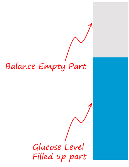
Note that the stacked chart has 2 parts
- In Blue – Glucose Levels
- In Grey – The Empty Part
All that you have to do now is to carefully place the hollow (human) infographic shape on top of the stacked chart and you are done 🙂 Make sure that the human shape is white in color
Also check out Infographics Charts in Excel – Part 1
Some More Interesting Charting Tricks
- Customize the Markers of a Chart
- Dynamically encircle point in a Line Chart
- Draw a Chart with 1 Key Stroke
- Add a Total Bubble at the end of the Line Chart
- Dynamically Highlight Max and Min Points in your Chart
- Highlight Any Bar of a Column Chart