I generally don’t read news papers but I have subscribed to 2 of them…Why?
- I take a look at all the charts and visualizations and steal ideas from the good ones and come up with ideas to improve the bad ones
- As far as the noise (news) is concerned, it will find a way to reach me if it is important enough!
In a similar chart browsing sessions last week, I found a bad chart! Take a look..
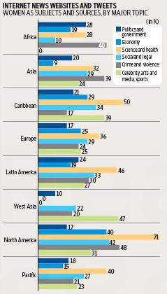
It appeared in MINT (4th May) on Page 24 and talked about the hot topics of social media (and other channels) region wise.
I don’t think this is an example of a good chart
Can you rework this chart and make it awesome?
DOWNLOAD THE DATA (not exactly matching to the chart above) but good enough to get started! You are free to make it dynamic by using
- Form Controls
- VBA
- Formulas (named ranges)
- Or any other superhuman technique that you know of
Send in your responses to [email protected] with the subject line “Make a Chart from this Data” and leave a snapshot of your chart in the comments below
Come on show us your charting hubris! Cheers!