Recently I was helping a friend create a dynamic line chart that can plot multiple projections. Thanks to him, it came out pretty awesome and it definitely deserves to be shared
Let’s take dive into how would you make something like this..
Consider this Data
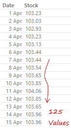
We have dates and stock price for 125 days. Don’t get tempted to make a line chart yet, hold on.. there is some work to be done!
Next are the projections..
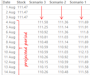
Take a note of a few things here..
- We have 3 projected scenarios
- They begin as soon as the historical data ends on 3rd Aug
- There are no values in stock column for the projected period
Let’s create a Line Chart
Create a simple line chart for 3 scenarios
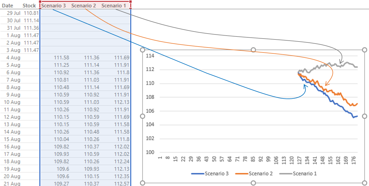
2 Important things –
- For each Scenario the data range begins from the first point so that the 3 scenarios have empty values in the beginning
- I have also styled the 3 lines in the dotted style by right clicking on each one of them and in the Outline option chose the color as grey and dashes
Creating Buttons aka.. Slicers for Selection
The buttons that you saw were slicers. I mean I could have used a dropdown or an option button instead but I like using slicers, they are intuitive and fancy
The only problem.. that slicers work with pivot tables and not regular data. So I am going to do a little hack..
Follow the steps
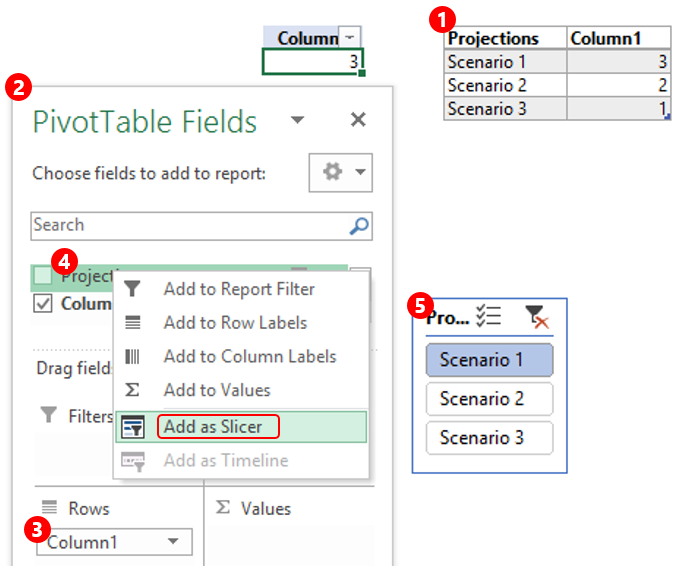
- Create a dummy data with 2 columns (Projections and Column 1) anywhere on the spreadsheet. Projections will have the text “Scenario 1/2/3” and Column 1 will have a corresponding number (1,2,3 in any order)
- On this dummy data create a Pivot Table in the same worksheet
- Next drop “Column 1” in Rows
- On Projections add a slicer by right clicking
- Now when you change the slicer the column number field in the pivot will obviously change
Link the Slicer to the data
Now that we have the slicer up and running we’ll link it with our data. You might have noticed that when I clicked on slicer the line got highlighted! Let’s set up some dummy calculations for that line
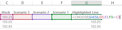
I am writing a simple choose formula in the column next to the Scenarios. Here is what the function will do
- It will go to the cell in the pivot table ($A$E6) and see what value is chosen by the slicer
- Depending on value (1, 2 or 3), it will pick up the 1st, 2nd or the 3rd Scenario Value.
- If the scenario is empty (for historical data) then it will show the stock price
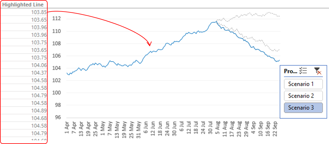
Adding Highlighted Line Dummy to the Chart
All you have got to do is add the dummy calculation to the chart and your chart should come up something like this
Adding a Marker Calculations
You might have noticed a red marker (in the chart) where the projections start. Yeah! the red straight line… Let’s add that to our chart. But before that we’ll again have to go the dummy way and create a new column of calculations
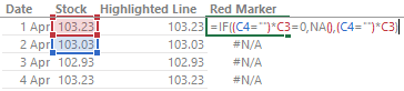
- A simple IF formula which returns the last stock price value, rest all is #N/A (#n/a because it does not show up in the chart)
- Now you would have only one value in chart and we can customize this to a marker with a straight line
Finally Adding Marker Dummy to the Chart
Simply add the Red Marker calculations to the chart
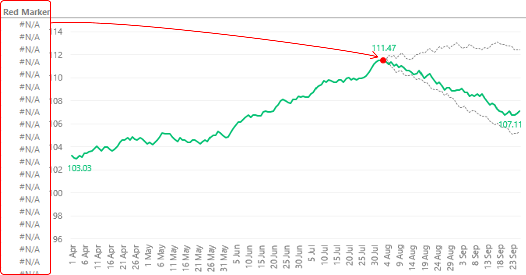
A couple of things
- The line might not even show up, so make sure to change the chart type (for Red Marker values) to a line with markers
- Since there is only 1 data point in the range so only the marker will show up
- In case you want to customize the marker to straight line, you can do that too!
Cleaning it up!
All you now need to do is a bit of chart formatting to spice things up. Simple things like
- Removing the clutter
- Adding Data Labels
- Adding % gain/loss calculations on the top
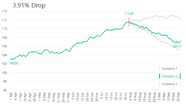
If you have stuck around till here, I guess you deserve to..
DOWNLOAD THE FINISHED CHART FROM BELOW
Although it may seem complex, but once you get the hang of it, it is not!
A Couple of more Dynamic Line Charts
- Highlight any part of the Line
- Add Direct Legends to the Line Chart
- Get a Total Bubble at the end of the Line Chart
- Timeline Chart in Excel
- Creating Phases in a Line Chart
- Encircle Main Points in a Line Chart
- Customize Markers in a Line Chart
- Stock Ticker Chart
- Highlight Max and Min points in a Line Chart