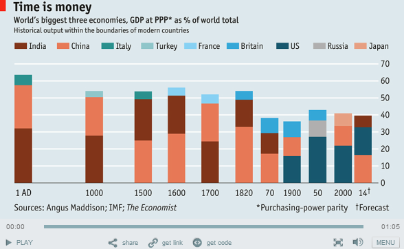
The other day during my web browsing (web window shopping) sessions, I stumbled upon a Charting animation from The Economist that used IMF data to show how the top 3 economies of the World have been changing over time. This (below) is what they published
My Opinion on this Chart
- I found this chart difficult to read because of the Indirect Color Labels (refer the color bar first and then look up for the country name)
- Also it becomes really difficult if I want to see how India or US has performed over the time?
So I thought of redoing this in Excel and here is a my reworked Chart. Check it out, it is pretty interesting!!
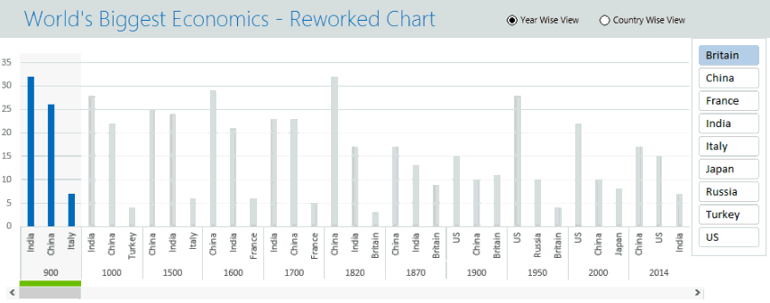
How I reworked on this Chart
- The first step was simple, it was just collecting the data. I looked at the Chart and assumed closest numbers for each data point
- Jotting down the problem areas. There were 2 of them
- Remove the Indirect labeling (somehow)
- Create a provision for a Country Wise View
- I quickly drew a Mock Chart (here is a little hand drawing!!) Although this is the 3rd iteration before I finally finalized the on this structure!
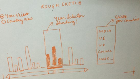
- It is always a best practice to do a mock chart first.. it saves a lot of rework and give a lot of mental clarity. Now I knew what I wanted, it was all about crunching the numbers and making the chart!
- Data Crunching and Finishing – Crunched the numbers and formatted the Chart
Download the reworked Economist Chart from Down Below. I have clearly laid out the calculations and logic, it is pretty easy to follow along!
Resources and Tips
Here are some related awesome resources for you to follow along!
- How to create a scroll bar list
- How to do Conditional Formatting in the Chart
- Pivot Tables – a free video course for you
- How to use the Index and VLookup Function
- How to use Cell Naming
Some more amazing Charting resources for you!
- How to Plot cities on a Map! – [A Must Read]
- How to have total bubbles at the end of line chart
- Check button chart
- REPT function chart
Please Share you Comments!
Please let me know what you think about this chart. Also If you would like to know how I did it, please leave a comment and I’ll post a detailed video tutorial on it! Cheers!